



HUM Nutrition Health & wellness
Rebrand
exploration
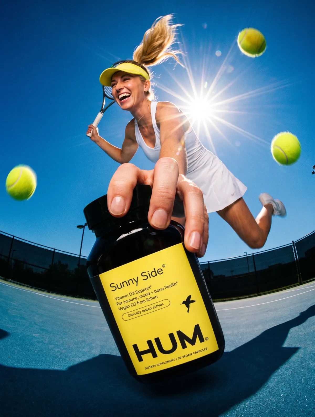
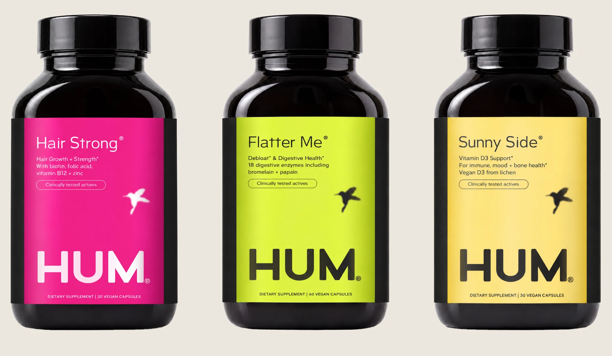
One brand-first label system across six HUM formulas, from Flatter Me to Beauty zzZz, carried into launch imagery, emails and a homepage concept.
The system
One system for six formulas: a clearer hierarchy and an anchored logo for stronger brand recognition on shelf.
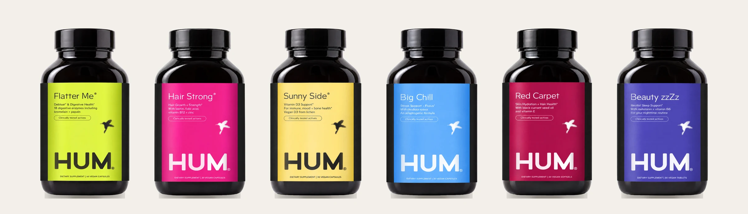
Before / after
Drag the bar to compare.

Identity
A mark strong enough to lead the shelf and simple enough to hold up small.
Wordmark
The bird lifts off the M, so the name stands on its own: bolder letters that read first on every bottle.

Bird mark
Less drawing, more silhouette: the detailed hummingbird becomes a soft shadow in flight, held in an oval, simple enough for any size.

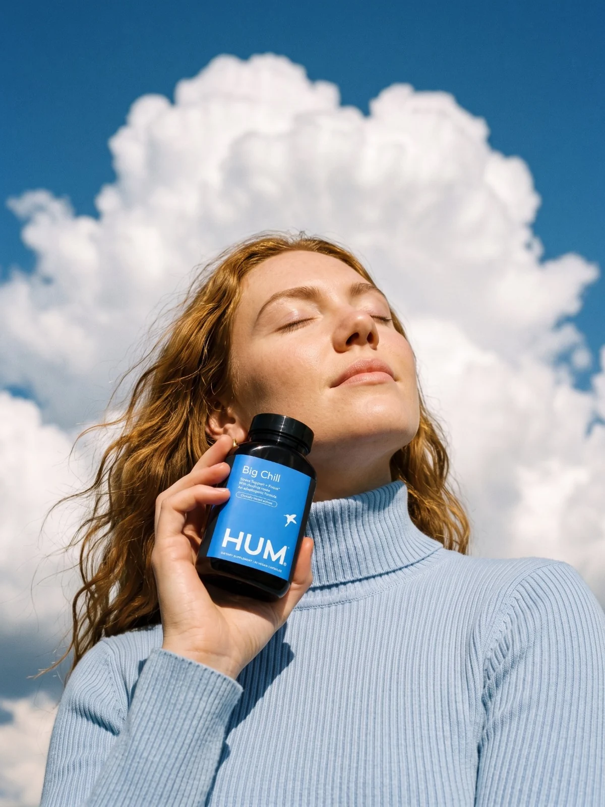
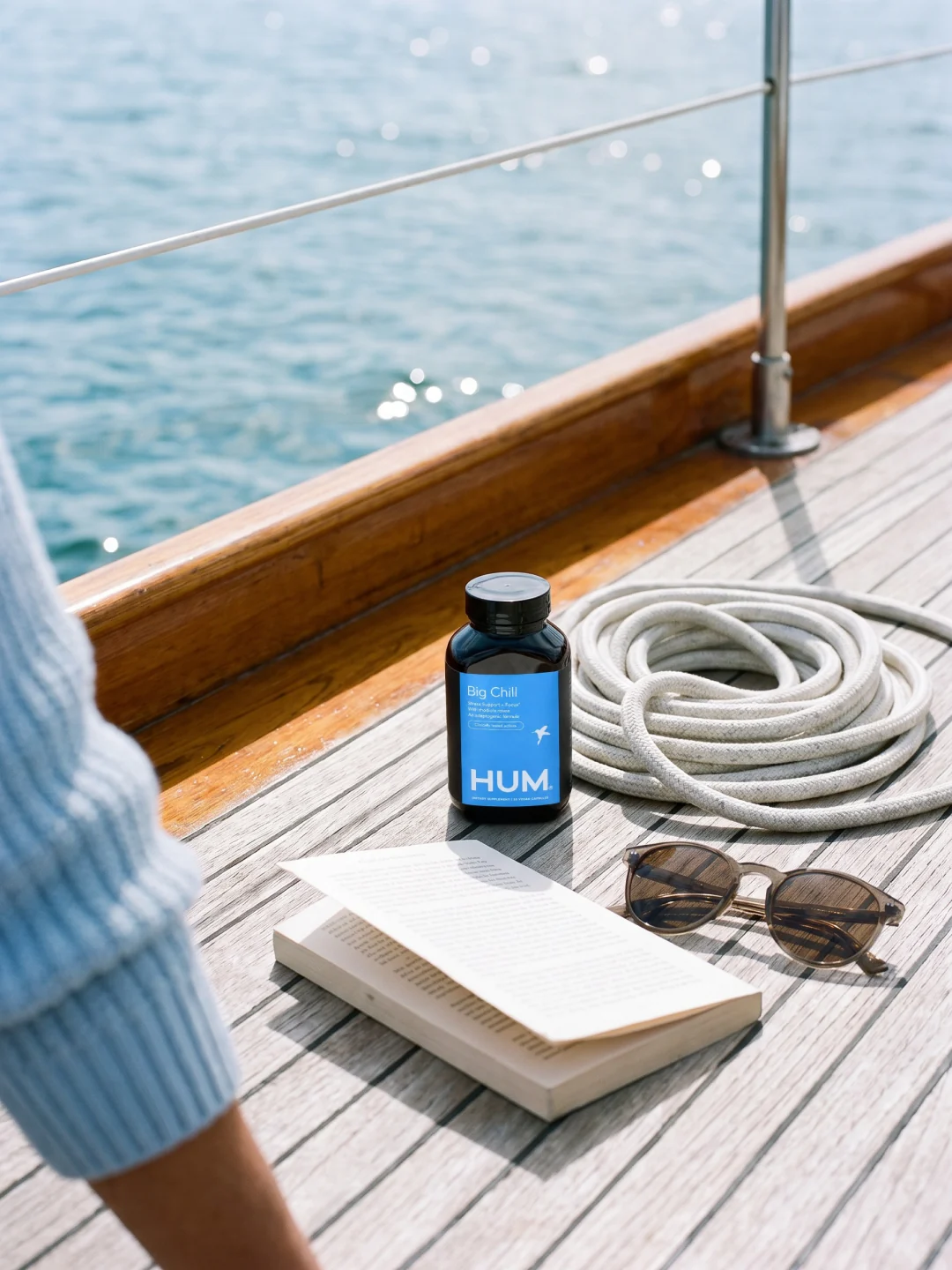

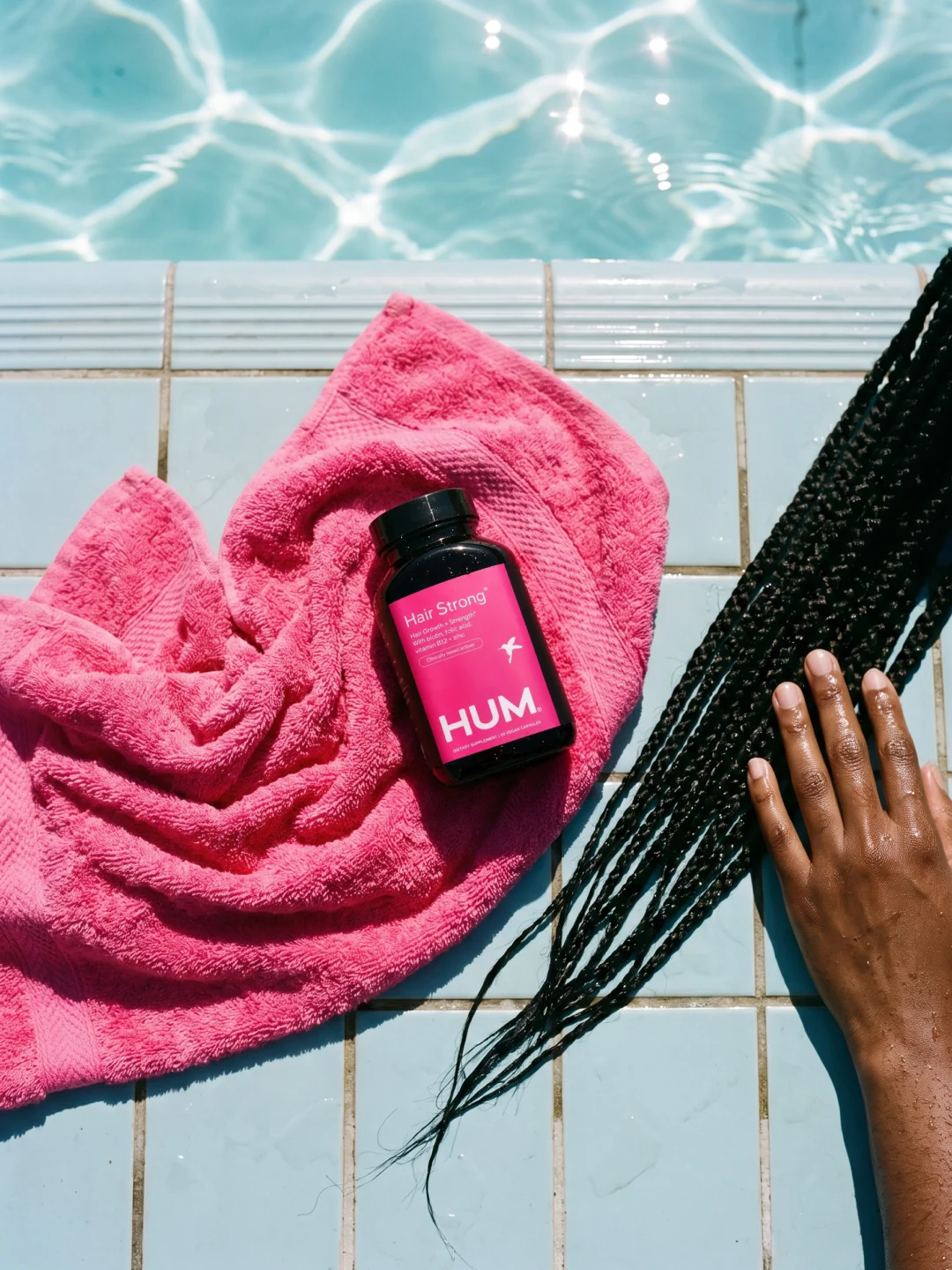
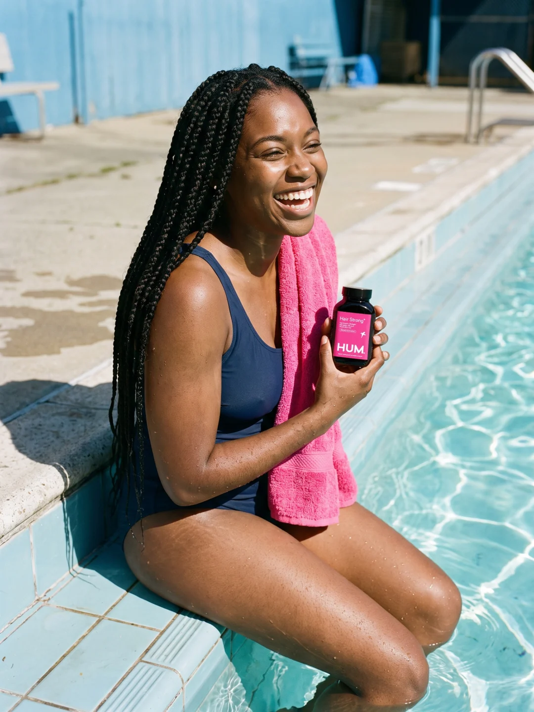
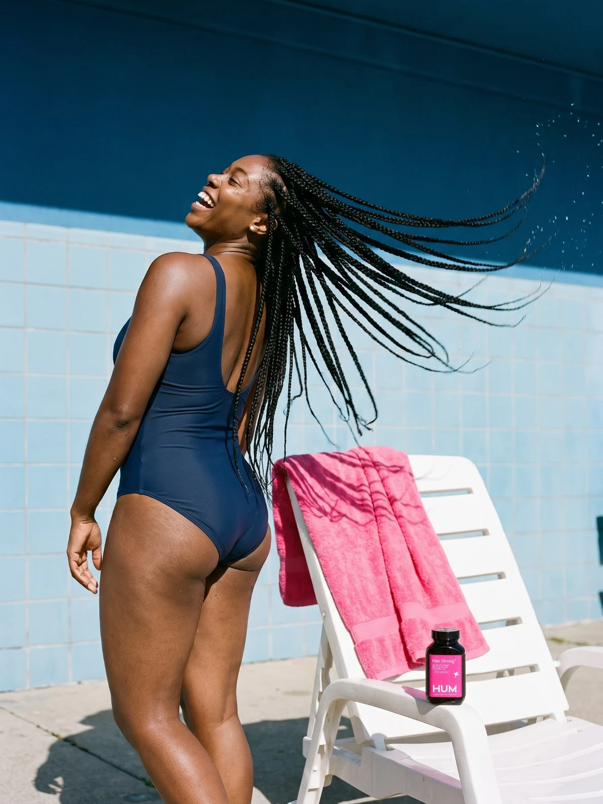
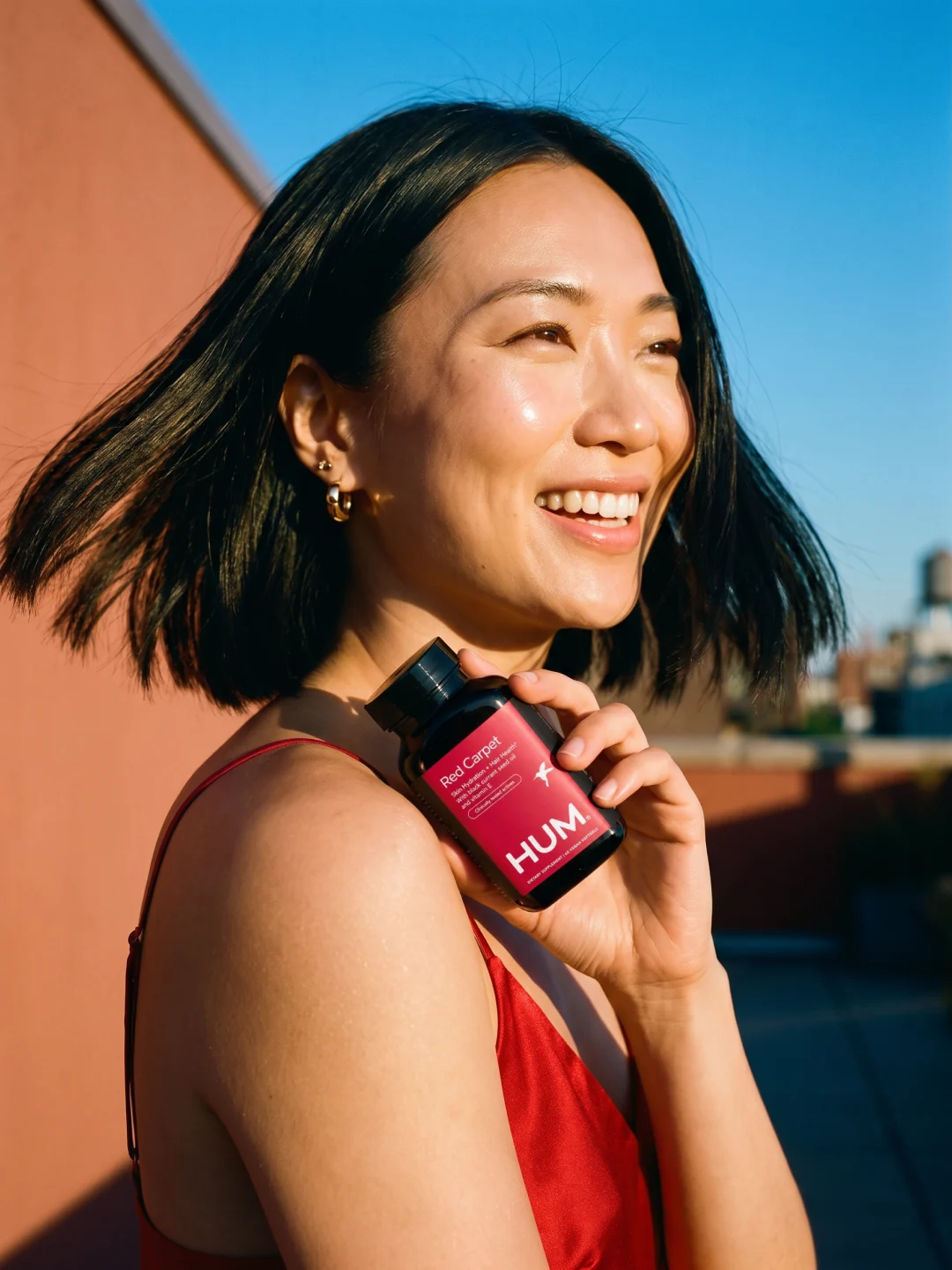
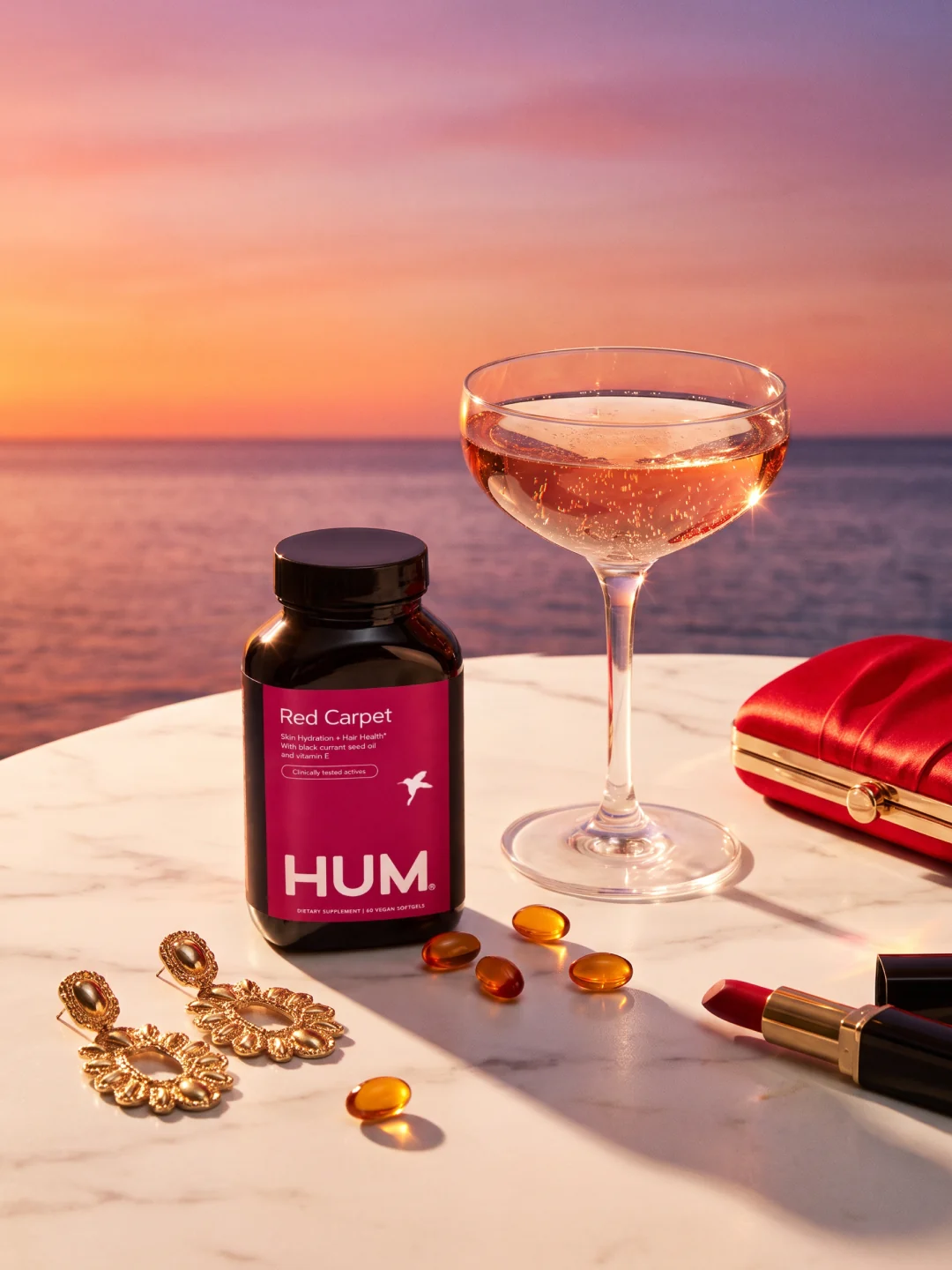

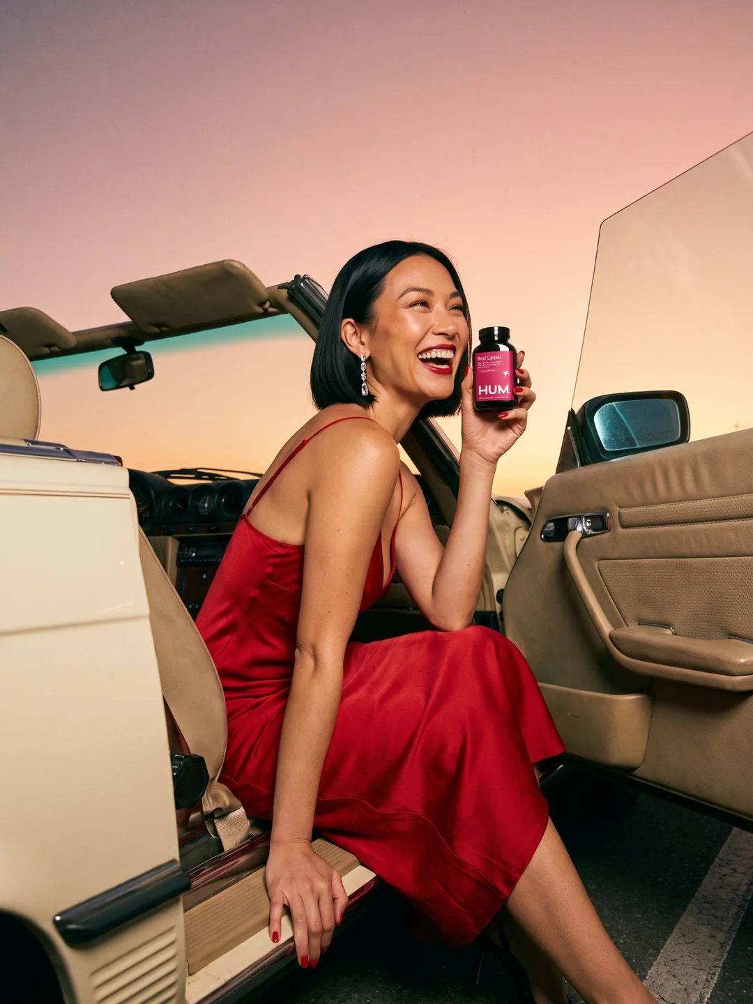
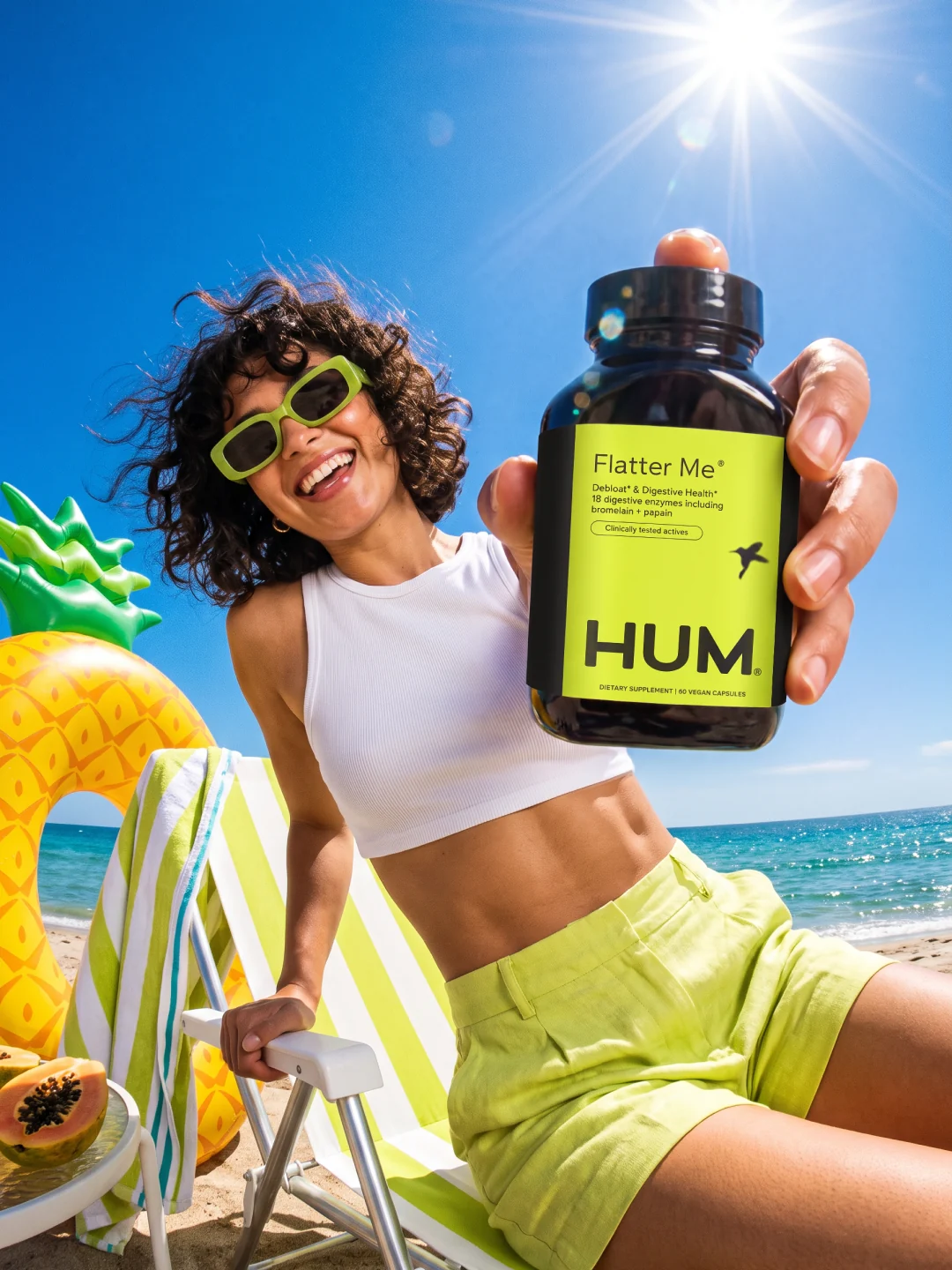
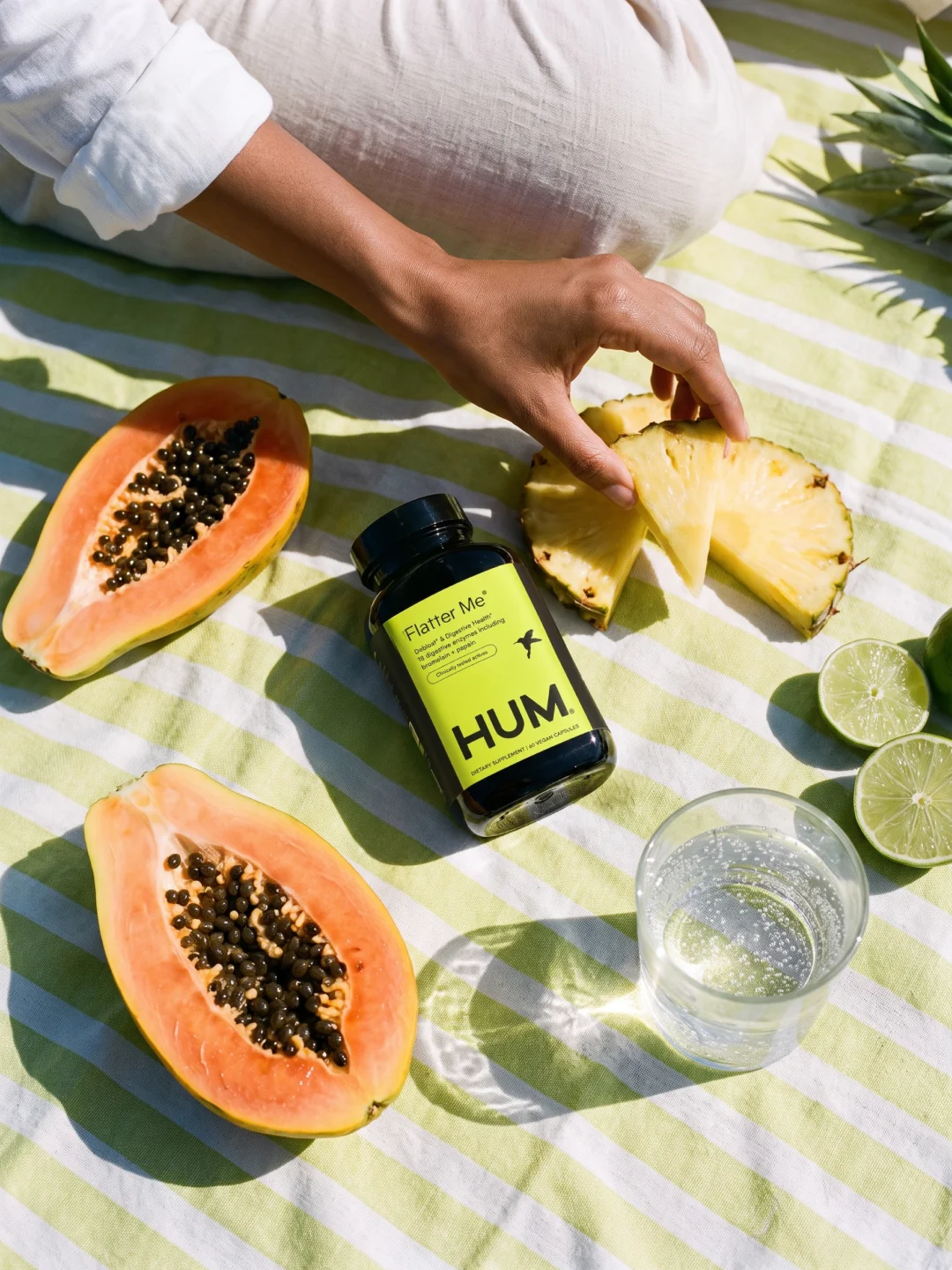
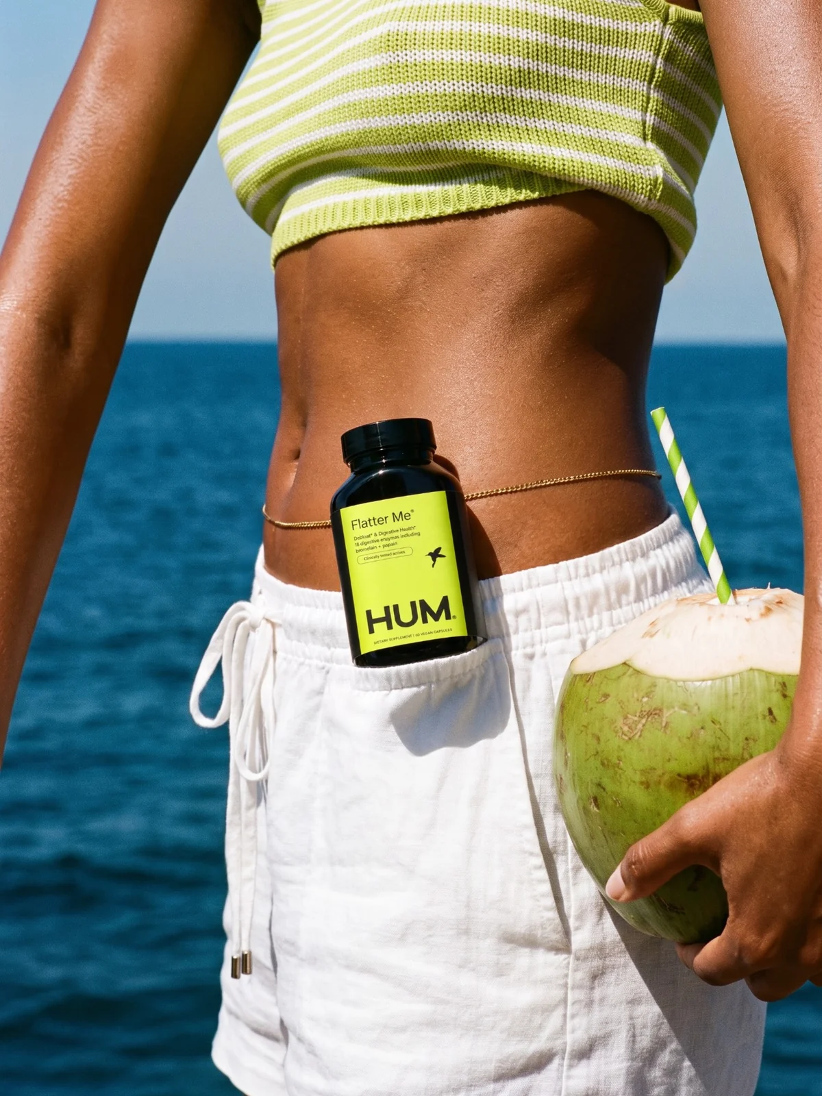
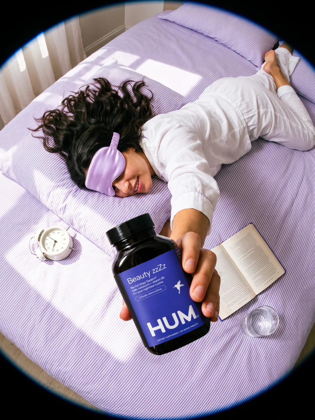
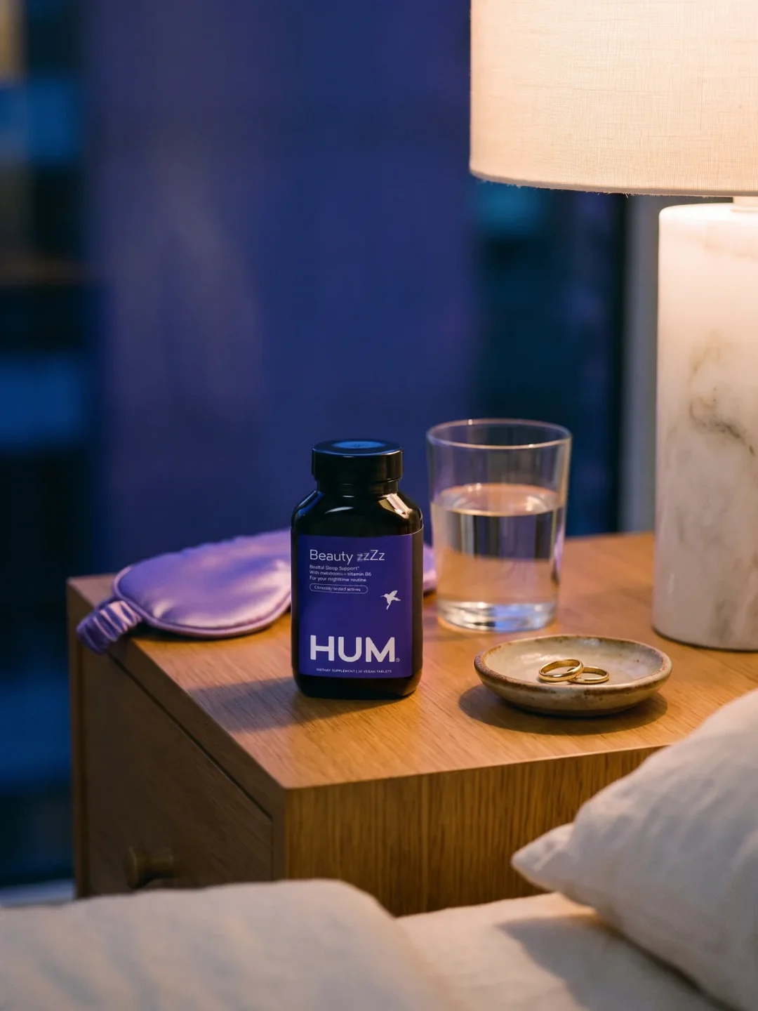
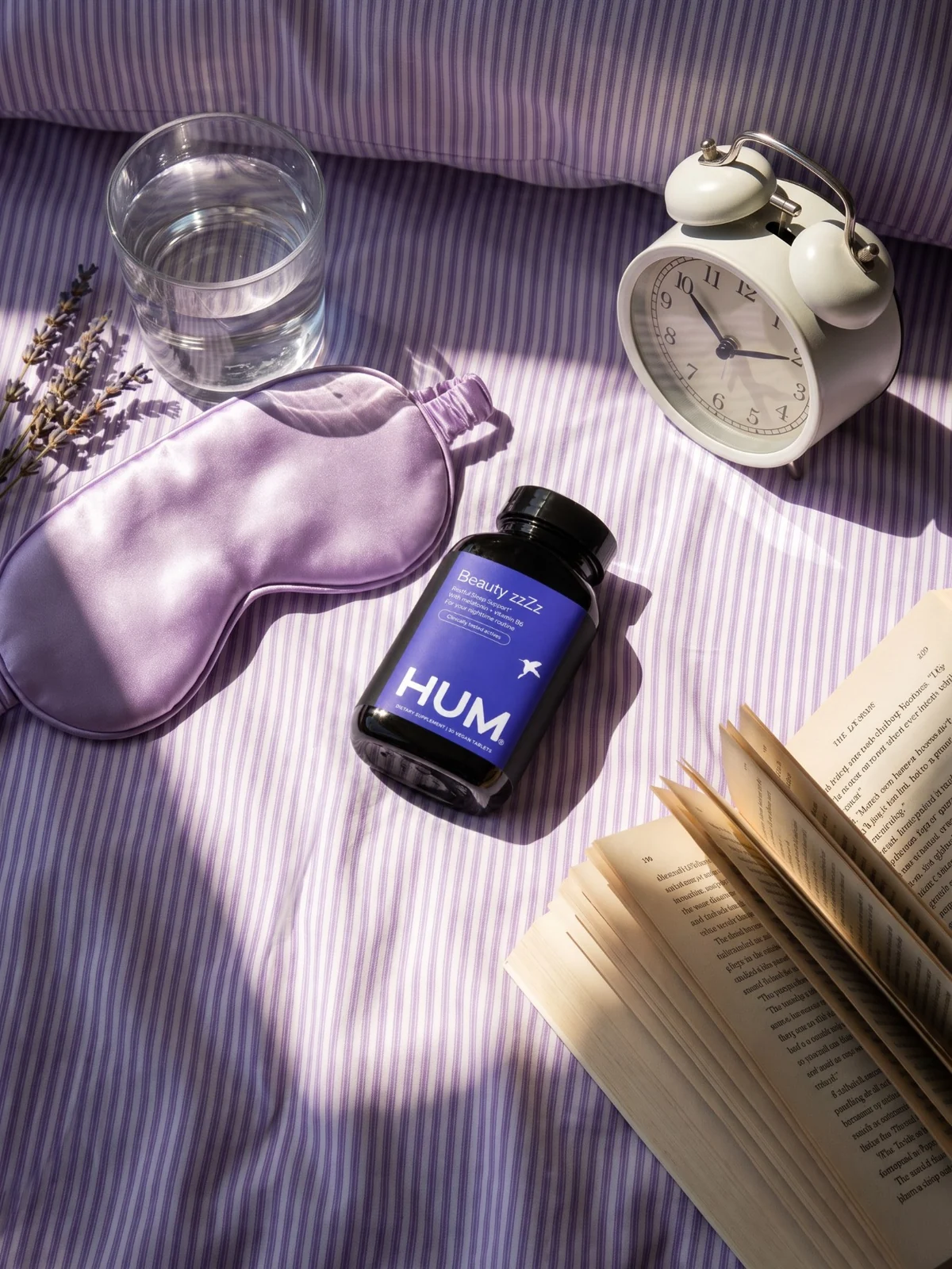
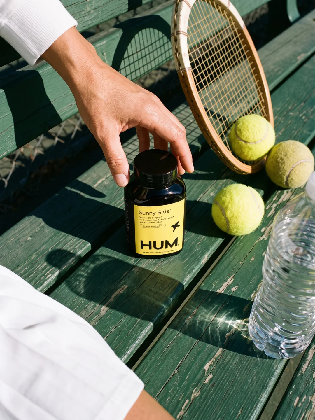
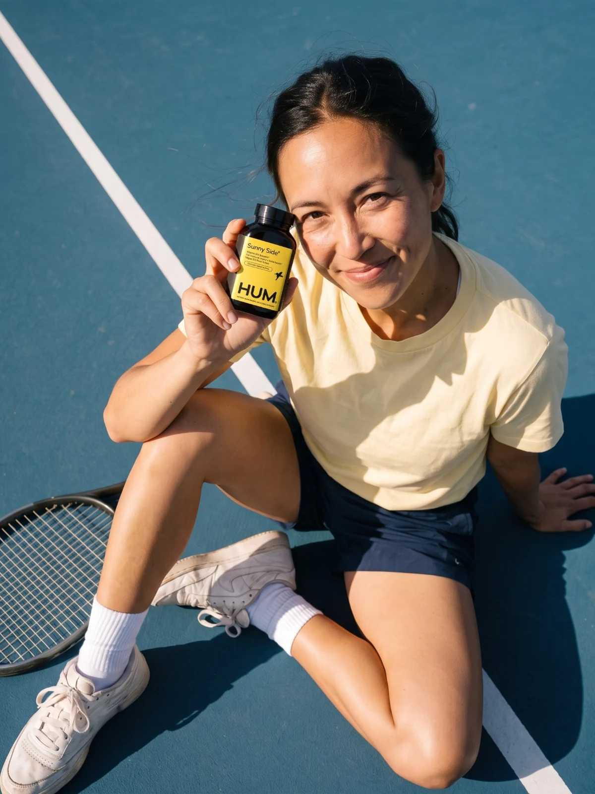
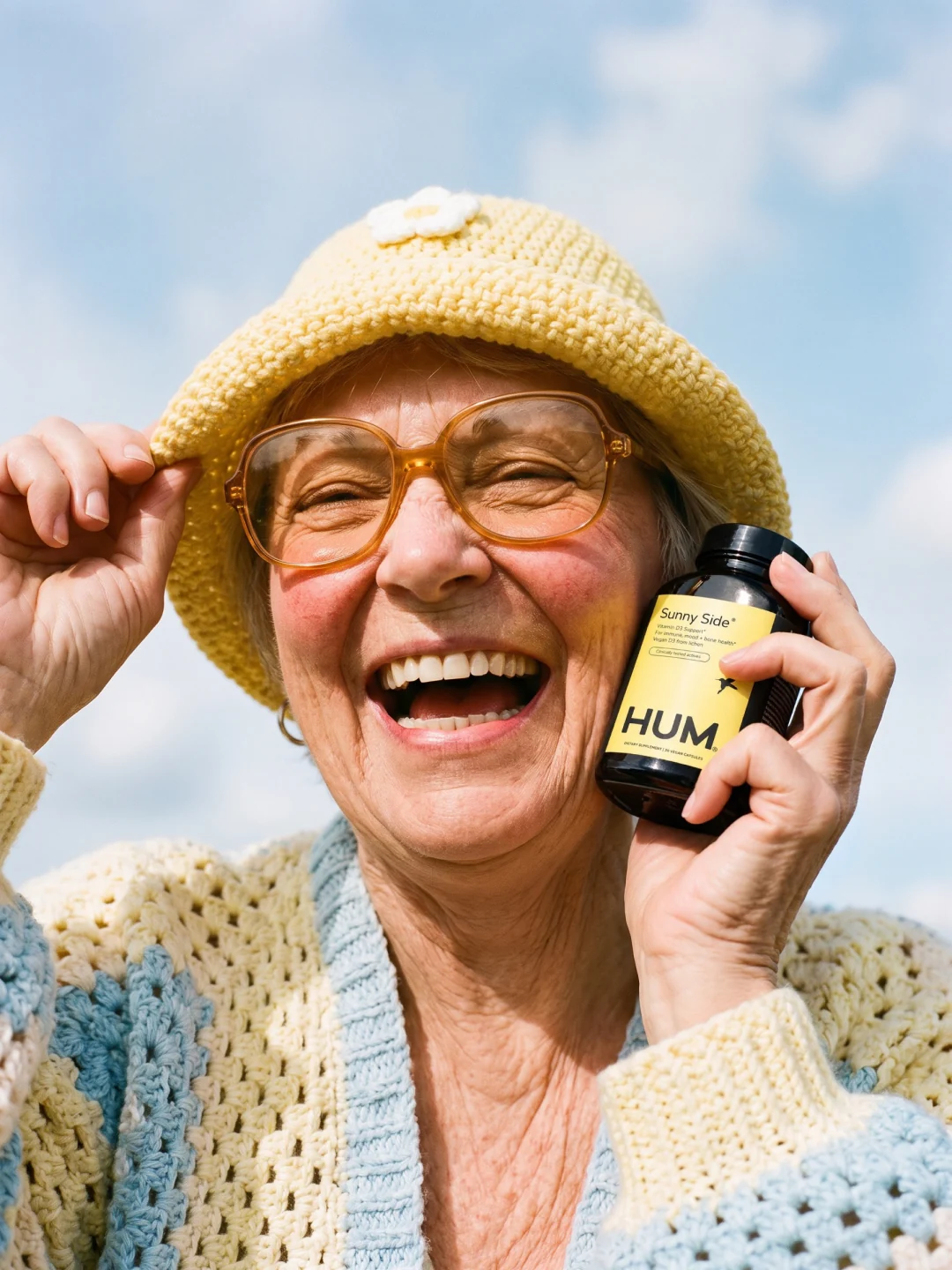
Every bottle helps you find your hum.
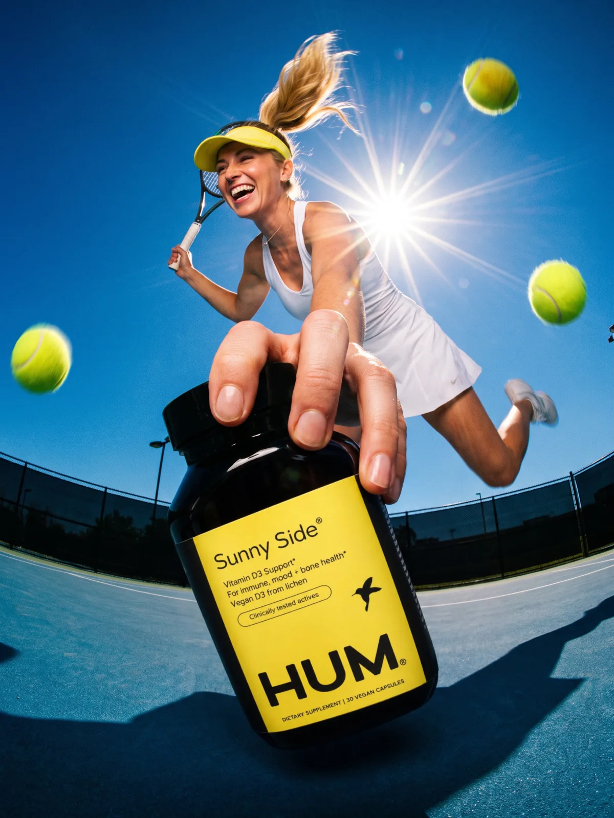
Calm, in sky blue. Big Chill lives under an open sky: clouds, deep breaths, nowhere to be.
Portfolio exploration
Launch
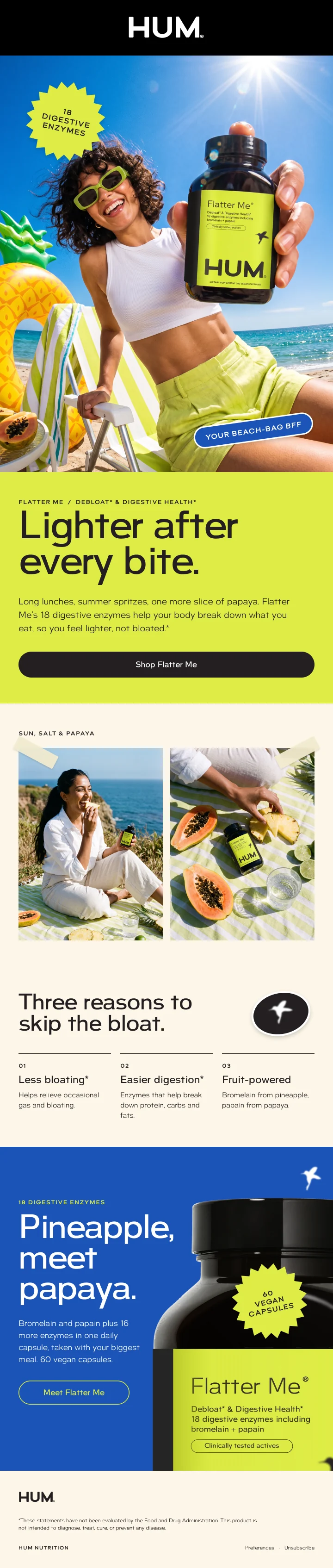
Objective: make each formula’s job obvious at a glance, so the label, the inbox and the homepage all answer the same question: what do you need to feel your best today?
Flatter Me
Beauty zzZz

Homepage
The homepage leads with the newest launch, then asks how you want to feel and matches the formula.
Before · humnutrition.com today
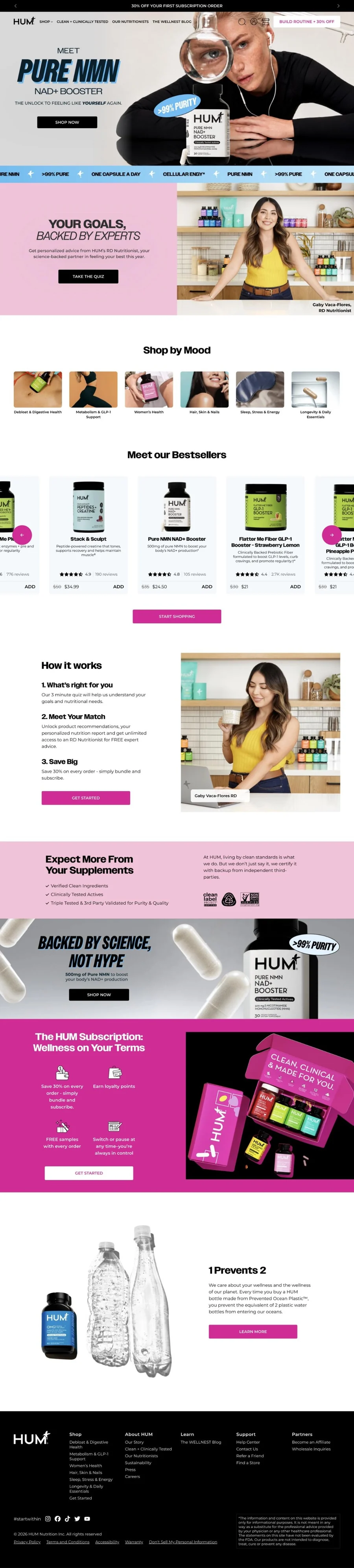
After · redesign concept